QVIK / visual brand identity
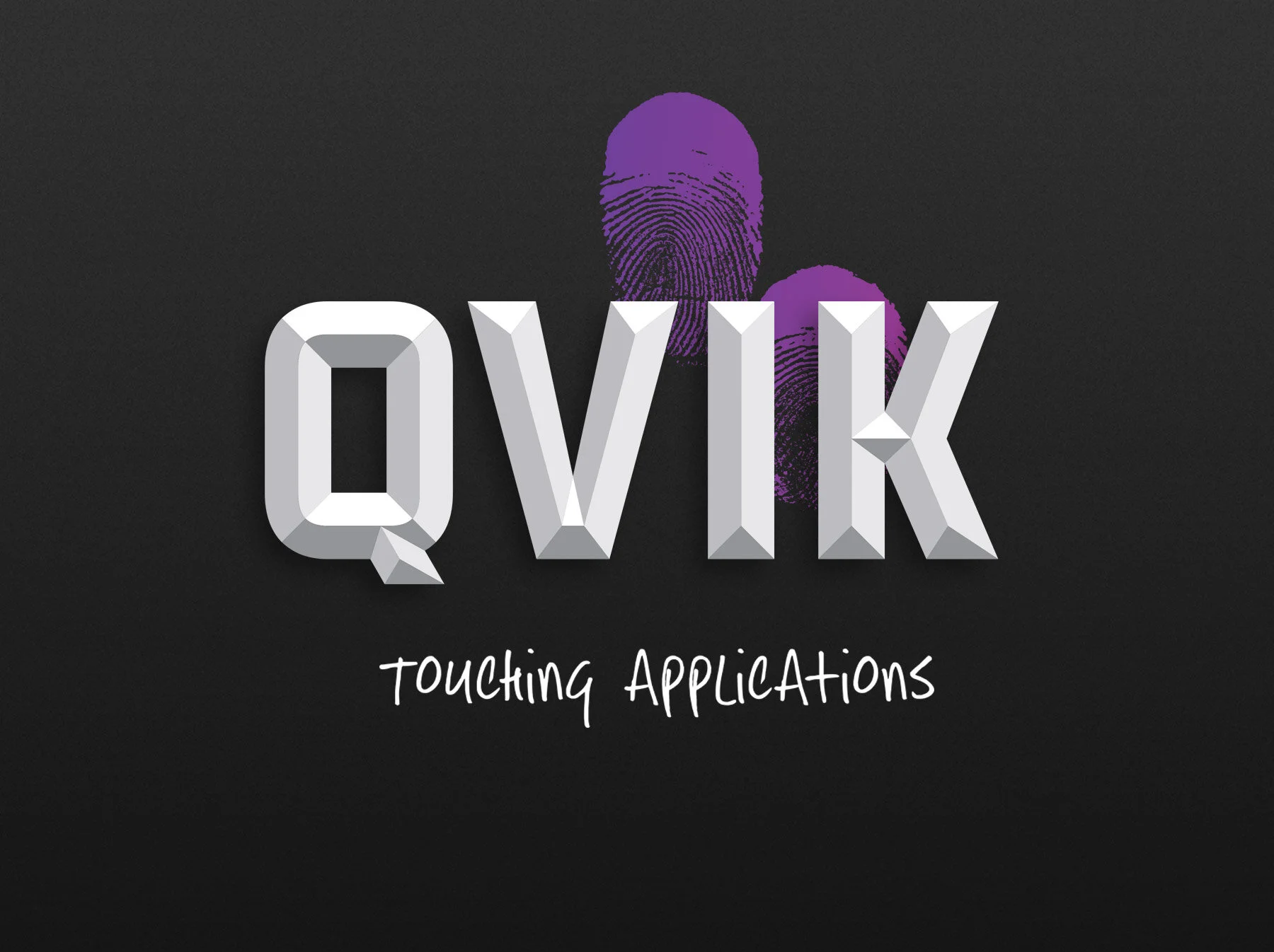
Brand keywords: courage, functionality and authenticity. The chiseled QVIK wireframe logo builds up to a finalised three dimensional logo that is metaphorically swiped by millions of users in the form of the meaningful, Touching Applications, that QVIK creates. Handprints were used in prehistoric cave paintings already 40,000 years ago and make an exciting combination with the high tech context. Meaningful, touching, applications are used on iPhone and iPad touch screens with hand gestures: swiping, tapping, pressing and pinching. These essential human touches became a dynamic finalising elements of the visual identity that literally has handprints of its creator. The colour spectrum of QVIK is a combination of the passionate, creative red hues and the technical, rational blue shades. The visual identity was created in close collaboration with one of the company co-founders, Elias Pietilä, who is many times awarded iPhone app wizard.


CLIENT: QVIK – a leading Nordic creative mobile application design and development agency. SERVICES: Visual brand identity YEAR: 2011 – 2012 CREDITS: Interior design in collaboration with interior architects: Heikki Ruoho and Teemu Järvi.